13 Graphics in R
13.1 base
- The original (default) graphics system in R.
- Highly customizable.
- Complex plots require many code lines.
- All the code. Try it!
> library(datasets)
> library(grDevices)
> library(graphics)
> library(gridGraphics)
>
>
> # demo1
> x <- stats::rnorm(50)
> par(bg = "white")
> plot(x, ann = FALSE, type = "n")
> abline(h = 0, col = gray(.90))
> lines(x, col = "green4", lty = "dotted")
> points(x, bg = "limegreen", pch = 21)
> title(main = "Simple Use of Color In a Plot",
> xlab = "Just a Whisper of a Label",
> col.main = "blue", col.lab = gray(.8),
> cex.main = 1.2, cex.lab = 1.0, font.main = 4, font.lab = 3)
>
> # demo2
> par(bg = "gray")
> pie(rep(1,24), col = rainbow(24), radius = 0.9)
> title(main = "A Sample Color Wheel", cex.main = 1.4, font.main = 3)
> title(xlab = "(Use this as a test of monitor linearity)", cex.lab = 0.8, font.lab = 3)
>
> # demo3
> pie.sales <- c(0.12, 0.3, 0.26, 0.16, 0.04, 0.12)
> names(pie.sales) <- c("Blueberry", "Cherry","Apple", "Boston Cream", "Other", "Vanilla Cream")
> pie(pie.sales,col = c("purple","violetred1","green3","cornsilk","cyan","white"))
> title(main = "January Pie Sales", cex.main = 1.8, font.main = 1)
> title(xlab = "(Don't try this at home kids)", cex.lab = 0.8, font.lab = 3)
>
> # demo4
> par(bg="cornsilk")
> n <- 10
> g <- gl(n, 100, n*100)
> x <- rnorm(n*100) + sqrt(as.numeric(g))
> boxplot(split(x,g), col="lavender", notch=TRUE)
> title(main="Notched Boxplots", xlab="Group", font.main=4, font.lab=1)
>
> # demo5
> par(bg="white")
> n <- 100
> x <- c(0,cumsum(rnorm(n)))
> y <- c(0,cumsum(rnorm(n)))
> xx <- c(0:n, n:0)
> yy <- c(x, rev(y))
> plot(xx, yy, type="n", xlab="Time", ylab="Distance")
> polygon(xx, yy, col="gray")
> title("Distance Between Brownian Motions")
>
>
> # demo6
> x <- c(0.00, 0.40, 0.86, 0.85, 0.69, 0.48, 0.54, 1.09, 1.11, 1.73, 2.05, 2.02)
> par(bg="lightgray")
> plot(x, type="n", axes=FALSE, ann=FALSE)
> usr <- par("usr")
> rect(usr[1], usr[3], usr[2], usr[4], col="cornsilk", border="black")
> lines(x, col="blue")
> points(x, pch=21, bg="lightcyan", cex=1.25)
> axis(2, col.axis="blue", las=1)
> axis(1, at=1:12, lab=month.abb, col.axis="blue")
> box()
> title(main= "The Level of Interest in R", font.main=4, col.main="red")
> title(xlab= "1996", col.lab="red")
>
> # demo7
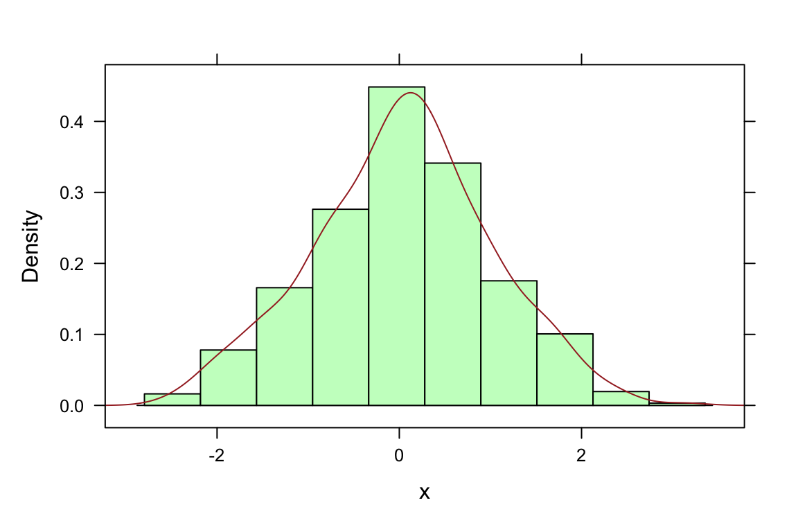
> par(bg="cornsilk")
> set.seed(1)
> x <- rnorm(1000)
> hist(x, xlim=range(-4, 4, x), col="lavender", main="")
> title(main="1000 Normal Random Variates", font.main=3)
>
> # demo8
> pairs(iris[1:4], main="Edgar Anderson's Iris Data", font.main=4, pch=19)
>
> # demo9
> pairs(iris[1:4], main="Edgar Anderson's Iris Data", pch=21,
> bg = c("red", "green3", "blue")[unclass(iris$Species)])
>
> # demo10
> x <- 10*1:nrow(volcano)
> y <- 10*1:ncol(volcano)
> lev <- pretty(range(volcano), 10)
> par(bg = "lightcyan")
> pin <- par("pin")
> xdelta <- diff(range(x))
> ydelta <- diff(range(y))
> xscale <- pin[1]/xdelta
> yscale <- pin[2]/ydelta
> scale <- min(xscale, yscale)
> xadd <- 0.5*(pin[1]/scale - xdelta)
> yadd <- 0.5*(pin[2]/scale - ydelta)
> plot(numeric(0), numeric(0),
> xlim = range(x)+c(-1,1)*xadd, ylim = range(y)+c(-1,1)*yadd,
> type = "n", ann = FALSE)
> usr <- par("usr")
> rect(usr[1], usr[3], usr[2], usr[4], col="green3")
> clines <- contourLines(x, y, volcano, levels = lev)
> lapply(clines, lines, col="yellow", lty="solid")
> box()
> title("A Topographic Map of Maunga Whau", font= 4)
> title(xlab = "Meters North", ylab = "Meters West", font= 3)
> mtext("10 Meter Contour Spacing", side=3, line=0.35, outer=FALSE,
> at = mean(par("usr")[1:2]), cex=0.7, font=3)
>
> # demo11
> par(bg="cornsilk")
> coplot(lat ~ long | depth, data = quakes, pch = 21, bg = "green3")13.2 lattice
- Shorter syntax for complex (e.g. multipanel) plots.
- Less custumizable than
base.
> library(lattice)
> demo(lattice)
##
##
##  demo(lattice)
##  ---- ~~~~~~~
##
## > require(grid)
## Loading required package: grid
##
## > old.prompt <- devAskNewPage(TRUE)
##
## > ## store current settings, to be restored later
## > old.settings <- trellis.par.get()
##
## > ## changing settings to new 'theme'
## > trellis.par.set(theme = col.whitebg())
##
## > ## simulated example, histogram and kernel density estimate superposed
## > x <- rnorm(500)
##
## > densityplot(~x)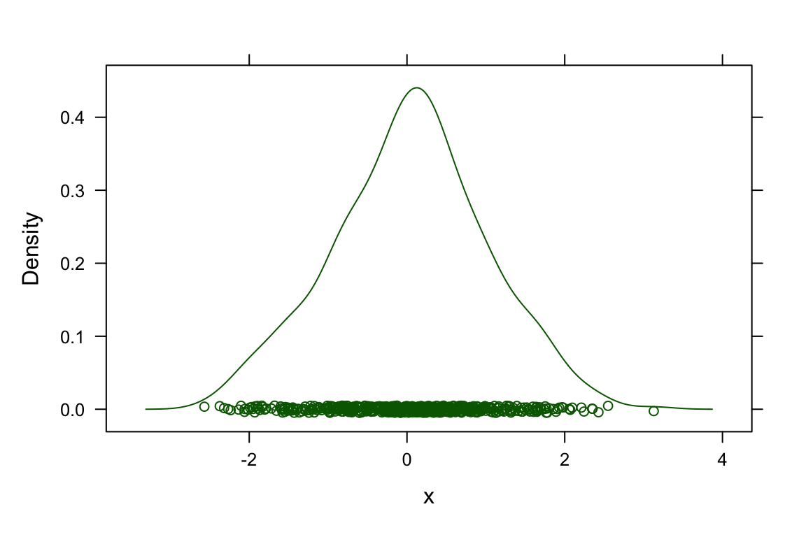
##
## > histogram(x, type = "density",
## +           panel = function(x, ...) {
## +               panel.histogram(x, ...)
## +               panel.densityplot(x, col = "brown", plot.points = FALSE)
## +           })
##
## > ## Using a custom panel function to superpose a fitted normal density
## > ## on a Kernel Density Estimate
## >
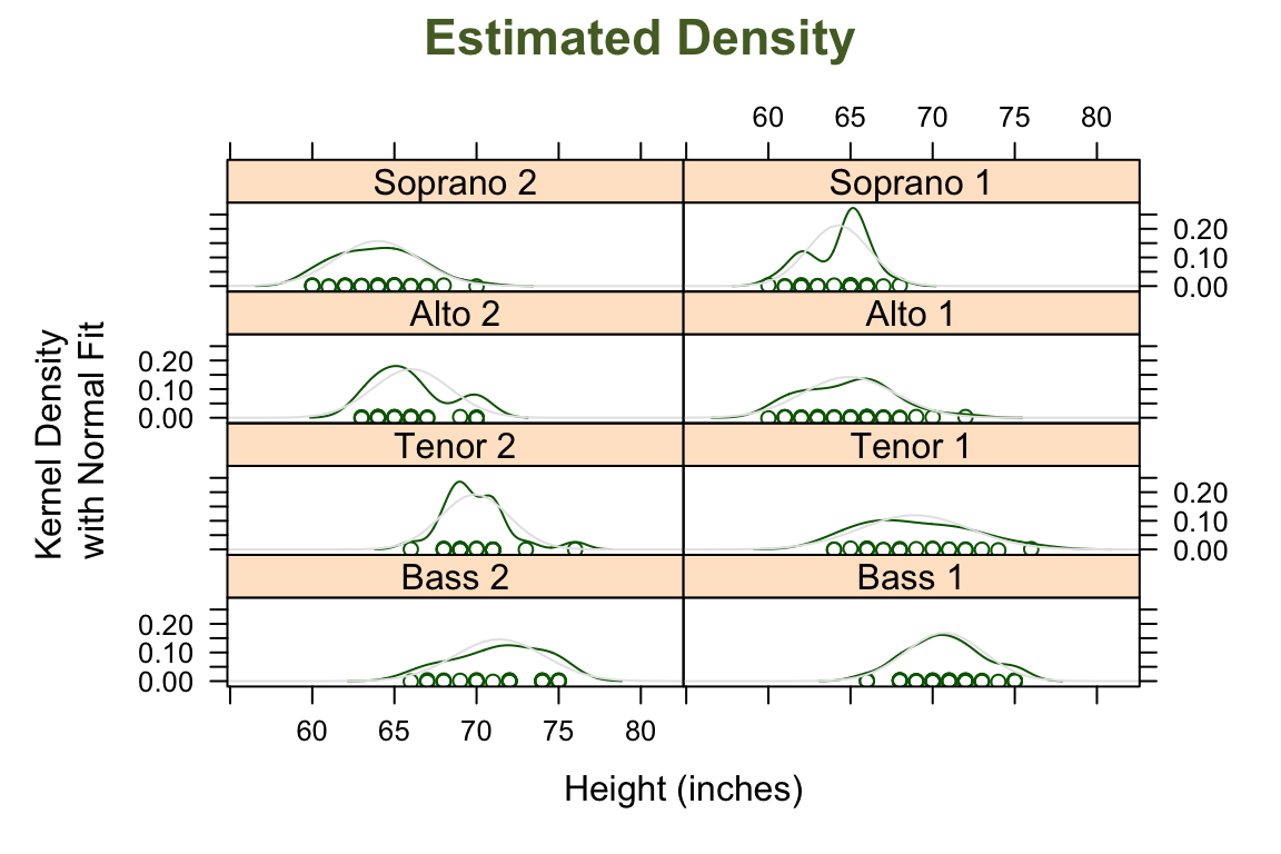
## > densityplot( ~ height | voice.part, data = singer, layout = c(2, 4),
## + xlab = "Height (inches)",
## + ylab = "Kernel Density\n with Normal Fit",
## + main = list("Estimated Density", cex = 1.4, col = "DarkOliveGreen"),
## + panel = function(x, ...) {
## + panel.densityplot(x, ...)
## + panel.mathdensity(dmath = dnorm,
## + args = list(mean=mean(x),sd=sd(x)))
## + } )
##
## > ## user defined panel functions and fonts
## >
## > states <- data.frame(state.x77,
## +                      state.name = dimnames(state.x77)[[1]],
## +                      state.region = factor(state.region))
##
## > xyplot(Murder ~ Population | state.region, data = states,
## +        groups = state.name,
## +        panel = function(x, y, subscripts, groups)
## +        ltext(x = x, y = y, labels = groups[subscripts],
## +              cex=.9, fontfamily = "HersheySans", fontface = "italic"),
## +        par.strip.text = list(cex = 1.3, font = 4, col = "brown"),
## +        xlab = list("Estimated Population, July 1, 1975", font = 2),
## +        ylab = list("Murder Rate (per 100,000 population), 1976", font = 2),
## +        main = list("Murder Rates in US states", col = "brown", font = 4))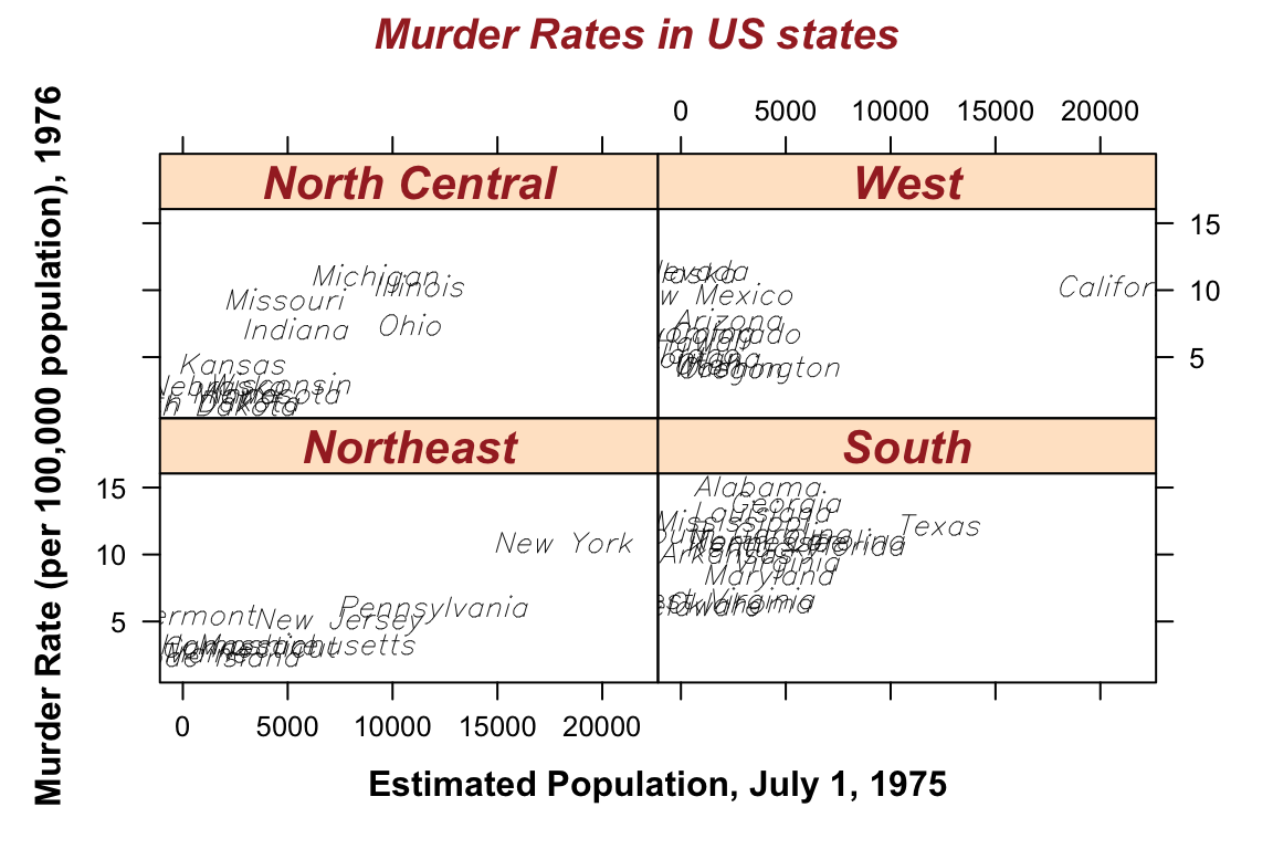
##
## > ##graphical parameters for xlab etc can also be changed permanently
## > trellis.par.set(list(par.xlab.text = list(font = 2),
## +                      par.ylab.text = list(font = 2),
## +                      par.main.text = list(font = 4, col = "brown")))
##
## > ## Same with some multiple line text
## > levels(states$state.region) <-
## +     c("Northeast", "South", "North\n Central",  "West")
##
## > xyplot(Murder  ~ Population | state.region, data = states,
## +        groups = as.character(state.name),
## +        panel = function(x, y, subscripts, groups)
## +        ltext(x = x, y = y, labels = groups[subscripts], srt = -50, col = "blue",
## +              cex=.9, fontfamily = "HersheySans"),
## +        par.strip.text = list(cex = 1.3, font = 4, col = "brown", lines = 2),
## +        xlab = "Estimated Population\nJuly 1, 1975",
## +        ylab = "Murder Rate \n(per 100,000 population)\n 1976",
## +        main = "Murder Rates in US states")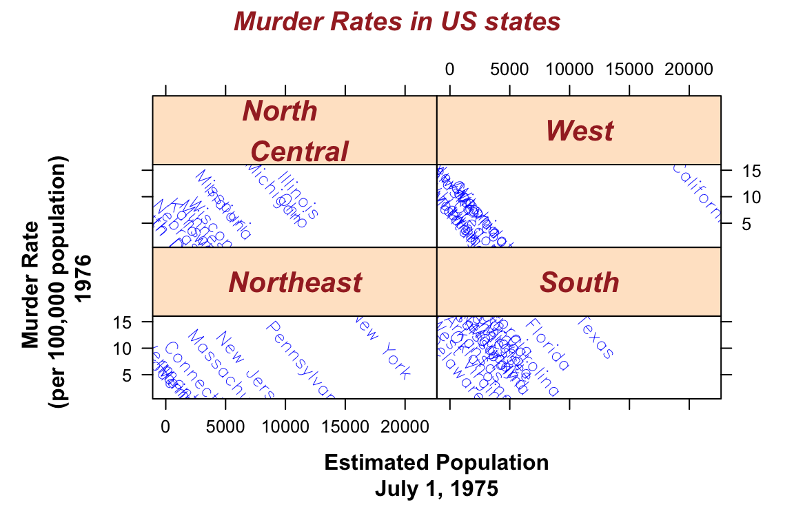
##
## > ##setting these back to their defaults
## > trellis.par.set(list(par.xlab.text = list(font = 1),
## +                      par.ylab.text = list(font = 1),
## +                      par.main.text = list(font = 2, col = "black")))
##
## > ##levelplot
## >
## > levelplot(volcano, colorkey = list(space = "top"),
## +           sub = "Maunga Whau volcano", aspect = "iso")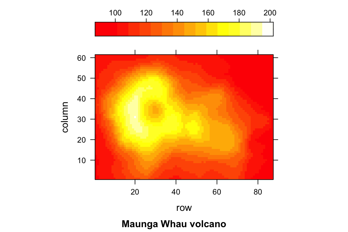
##
## > ## wireframe
## > wireframe(volcano, shade = TRUE,
## +           aspect = c(61/87, 0.4),
## +           screen = list(z = -120, x = -45),
## +           light.source = c(0,0,10), distance = .2,
## +           shade.colors.palette = function(irr, ref, height, w = .5)
## +           grey(w * irr + (1 - w) * (1 - (1-ref)^.4)))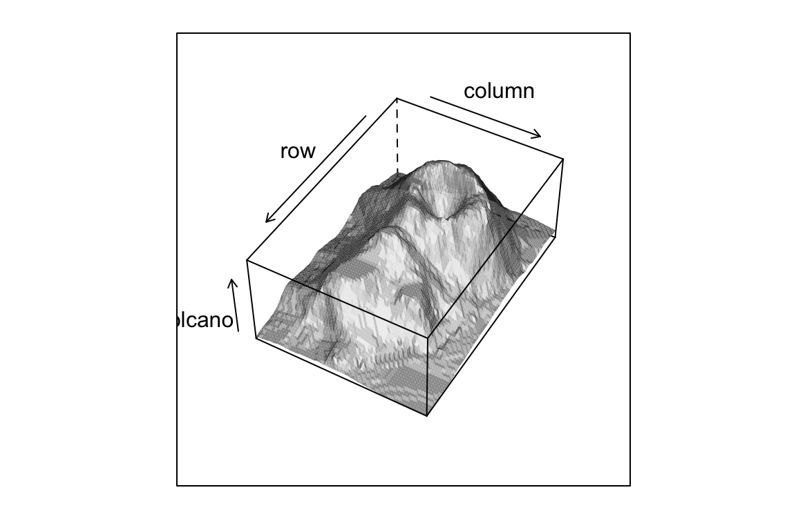
##
## > ## 3-D surface parametrized on a 2-D grid
## >
## > n <- 50
##
## > tx <- matrix(seq(-pi, pi, length.out = 2*n), 2*n, n)
##
## > ty <- matrix(seq(-pi, pi, length.out = n) / 2, 2*n, n, byrow = T)
##
## > xx <- cos(tx) * cos(ty)
##
## > yy <- sin(tx) * cos(ty)
##
## > zz <- sin(ty)
##
## > zzz <- zz
##
## > zzz[,1:12 * 4] <- NA
##
## > wireframe(zzz ~ xx * yy, shade = TRUE, light.source = c(3,3,3))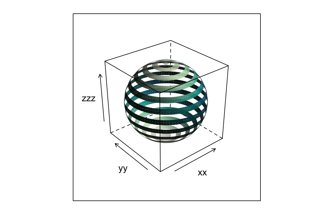
##
## > ## Example with panel.superpose.
## >
## > xyplot(Petal.Length~Petal.Width, data = iris, groups=Species,
## +        panel = panel.superpose,
## +        type = c("p", "smooth"), span=.75,
## +        col.line = trellis.par.get("strip.background")$col,
## +        col.symbol = trellis.par.get("strip.shingle")$col,
## +        key = list(title = "Iris Data", x = .15, y=.85, corner = c(0,1),
## +            border = TRUE,
## +            points = list(col=trellis.par.get("strip.shingle")$col[1:3],
## +            pch = trellis.par.get("superpose.symbol")$pch[1:3],
## +            cex = trellis.par.get("superpose.symbol")$cex[1:3]
## +            ),
## +            text = list(levels(iris$Species))))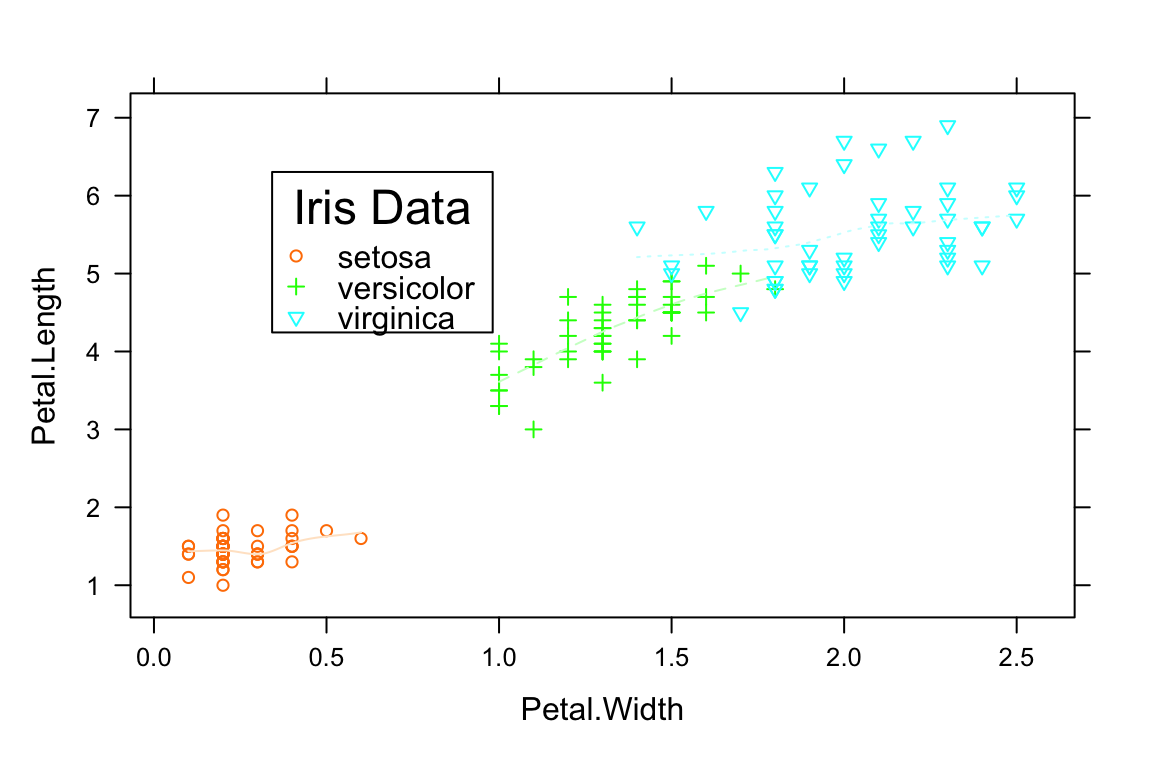
##
## > ## non-trivial strip function
## >
## > barchart(variety ~ yield | year * site, barley, origin = 0,
## +          layout = c(4, 3),
## +          between = list(x = c(0, 0.5, 0)),
## +          ## par.settings = list(clip = list(strip = "on")),
## +          strip =
## +          function(which.given,
## +                   which.panel,
## +                   factor.levels,
## +                   bg = trellis.par.get("strip.background")$col[which.given],
## +                   ...) {
## +              axis.line <- trellis.par.get("axis.line")
## +              pushViewport(viewport(clip = trellis.par.get("clip")$strip,
## +                                    name = trellis.vpname("strip")))
## +              if (which.given == 1)
## +              {
## +                  grid.rect(x = .26, just = "right",
## +                            name = trellis.grobname("fill", type="strip"),
## +                            gp = gpar(fill = bg, col = "transparent"))
## +                  ltext(factor.levels[which.panel[which.given]],
## +                        x = .24, y = .5, adj = 1,
## +                        name.type = "strip")
## +              }
## +              if (which.given == 2)
## +              {
## +                  grid.rect(x = .26, just = "left",
## +                            name = trellis.grobname("fill", type="strip"),
## +                            gp = gpar(fill = bg, col = "transparent"))
## +                  ltext(factor.levels[which.panel[which.given]],
## +                        x = .28, y = .5, adj = 0,
## +                        name.type = "strip")
## +              }
## +              upViewport()
## +              grid.rect(name = trellis.grobname("border", type="strip"),
## +                        gp =
## +                        gpar(col = axis.line$col,
## +                             lty = axis.line$lty,
## +                             lwd = axis.line$lwd,
## +                             alpha = axis.line$alpha,
## +                             fill = "transparent"))
## +          }, par.strip.text = list(lines = 0.4))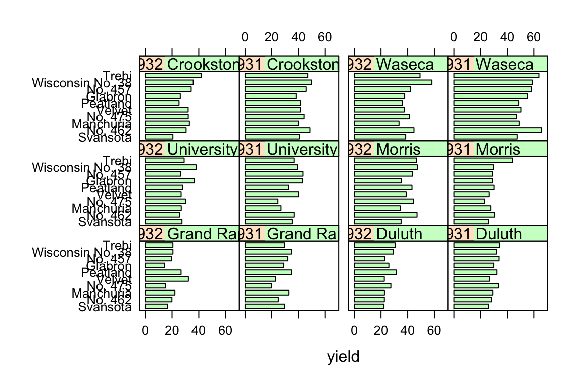
##
## > trellis.par.set(theme = old.settings, strict = 2)
##
## > devAskNewPage(old.prompt)
13.3 ggplot2
- By Hadley Wickham.
- Builds on the same ideas as
lattice. - gg stands for “grammar of graphics”.
- Get an overview of possible geoms here.
> library(ggplot2)
> example(qplot)
##
## qplot> # Use data from data.frame
## qplot> qplot(mpg, wt, data = mtcars)
## Warning: `qplot()` was deprecated in ggplot2 3.4.0.
## This warning is displayed once every 8 hours.
## Call `lifecycle::last_lifecycle_warnings()` to see where this warning was
## generated.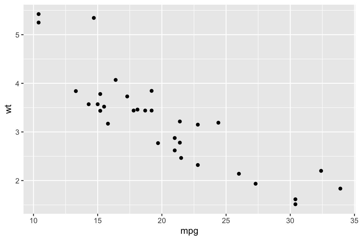
##
## qplot> qplot(mpg, wt, data = mtcars, colour = cyl)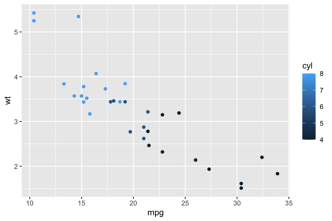
##
## qplot> qplot(mpg, wt, data = mtcars, size = cyl)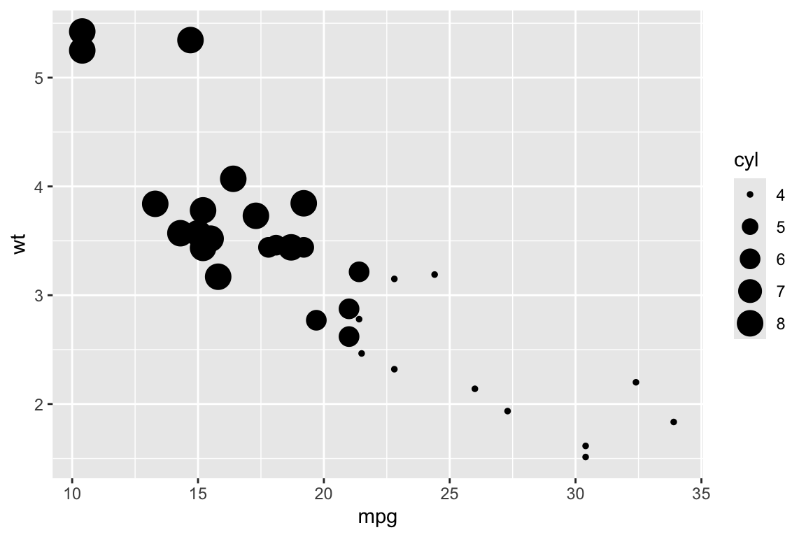
##
## qplot> qplot(mpg, wt, data = mtcars, facets = vs ~ am)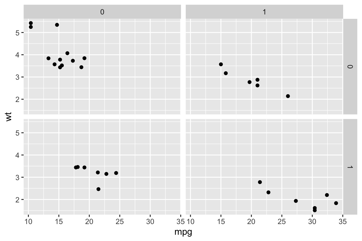
##
## qplot> ## No test:
## qplot> ##D set.seed(1)
## qplot> ##D qplot(1:10, rnorm(10), colour = runif(10))
## qplot> ##D qplot(1:10, letters[1:10])
## qplot> ##D mod <- lm(mpg ~ wt, data = mtcars)
## qplot> ##D qplot(resid(mod), fitted(mod))
## qplot> ##D
## qplot> ##D f <- function() {
## qplot> ##D    a <- 1:10
## qplot> ##D    b <- a ^ 2
## qplot> ##D    qplot(a, b)
## qplot> ##D }
## qplot> ##D f()
## qplot> ##D
## qplot> ##D # To set aesthetics, wrap in I()
## qplot> ##D qplot(mpg, wt, data = mtcars, colour = I("red"))
## qplot> ##D
## qplot> ##D # qplot will attempt to guess what geom you want depending on the input
## qplot> ##D # both x and y supplied = scatterplot
## qplot> ##D qplot(mpg, wt, data = mtcars)
## qplot> ##D # just x supplied = histogram
## qplot> ##D qplot(mpg, data = mtcars)
## qplot> ##D # just y supplied = scatterplot, with x = seq_along(y)
## qplot> ##D qplot(y = mpg, data = mtcars)
## qplot> ##D
## qplot> ##D # Use different geoms
## qplot> ##D qplot(mpg, wt, data = mtcars, geom = "path")
## qplot> ##D qplot(factor(cyl), wt, data = mtcars, geom = c("boxplot", "jitter"))
## qplot> ##D qplot(mpg, data = mtcars, geom = "dotplot")
## qplot> ## End(No test)
## qplot>
## qplot>
## qplot>- Basic plotting function:
ggplot(). - Used for advanced plots.
- Wrapper that resembles
plot()from the basic graphics system:qplot()used for “quick” plots. Syntax resembles that of plot(). - Grammar of graphics:
- All plots are objects. You build them incrementally. Use the operator
+to add to an existing plot; - Layer: Aestetics (
aes): Defines how the data are mapped. - Layer: Geometric objects (
geom): Points, lines, polygens, etc; - Layer: Coordinate system objects (
coord).
- All plots are objects. You build them incrementally. Use the operator
> library(ggplot2)
> head(diamonds)
## # A tibble: 6 × 10
##   carat cut       color clarity depth table price     x     y     z
##   <dbl> <ord>     <ord> <ord>   <dbl> <dbl> <int> <dbl> <dbl> <dbl>
## 1  0.23 Ideal     E     SI2      61.5    55   326  3.95  3.98  2.43
## 2  0.21 Premium   E     SI1      59.8    61   326  3.89  3.84  2.31
## 3  0.23 Good      E     VS1      56.9    65   327  4.05  4.07  2.31
## 4  0.29 Premium   I     VS2      62.4    58   334  4.2   4.23  2.63
## 5  0.31 Good      J     SI2      63.3    58   335  4.34  4.35  2.75
## 6  0.24 Very Good J     VVS2     62.8    57   336  3.94  3.96  2.48
>
> qplot(carat,price,data=diamonds)
- With
qplot()it is easy to work with:color: color each point according to a variable in the dataset, and add a corresponding legend;log: log-transform one or both axes;facets: split in a multi-panel plot according to a group variable;main: add a title.
- Let’s try modifying the previous plot by adding:
- color = cut
- log = “xy”
- facets =~clarity
- main = “Diamonds”,
one-by-one!
> qplot(carat,
+       price,
+       data=diamonds,
+       color = cut,
+       log="xy",
+       facets=~clarity,
+       main="Diamonds")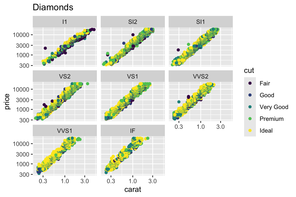
qplotis good for a start. However, in order to take full advantage ofggplot2, we must know what the plot is built of and how to modify the parts. The quick plotqplot(carat, price, data=diamonds)can be built incrementally by:
> # Define an empty plot object:
> p <- ggplot(data = diamonds)
>
> # Update the plot with the variables to plot:
> p <- p + aes(x = carat, y = price)
>
> # Add a "geom" object to the plot defining the type of the plot:
> p <- p + geom_point()
>
> # Display the object thereby triggering the actual plot:
> p
- We can use the “+” operator to modify the plot “p”. Lets see some examples in the following:
> # run one at a time
>
> example(geom_boxplot)
##
## gm_bxp> p <- ggplot(mpg, aes(class, hwy))
##
## gm_bxp> p + geom_boxplot()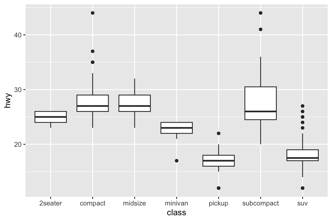
##
## gm_bxp> # Orientation follows the discrete axis
## gm_bxp> ggplot(mpg, aes(hwy, class)) + geom_boxplot()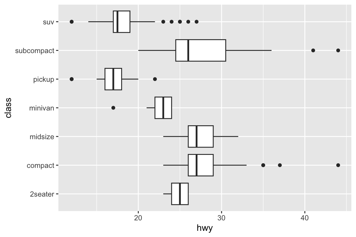
##
## gm_bxp> p + geom_boxplot(notch = TRUE)
## Notch went outside hinges
## ℹ Do you want `notch = FALSE`?
## Notch went outside hinges
## ℹ Do you want `notch = FALSE`?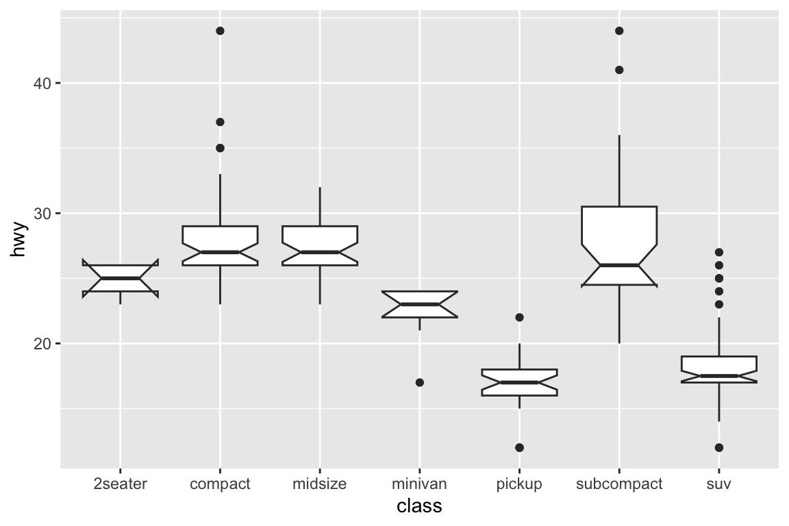
##
## gm_bxp> p + geom_boxplot(varwidth = TRUE)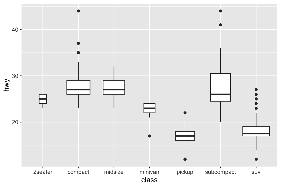
##
## gm_bxp> p + geom_boxplot(fill = "white", colour = "#3366FF")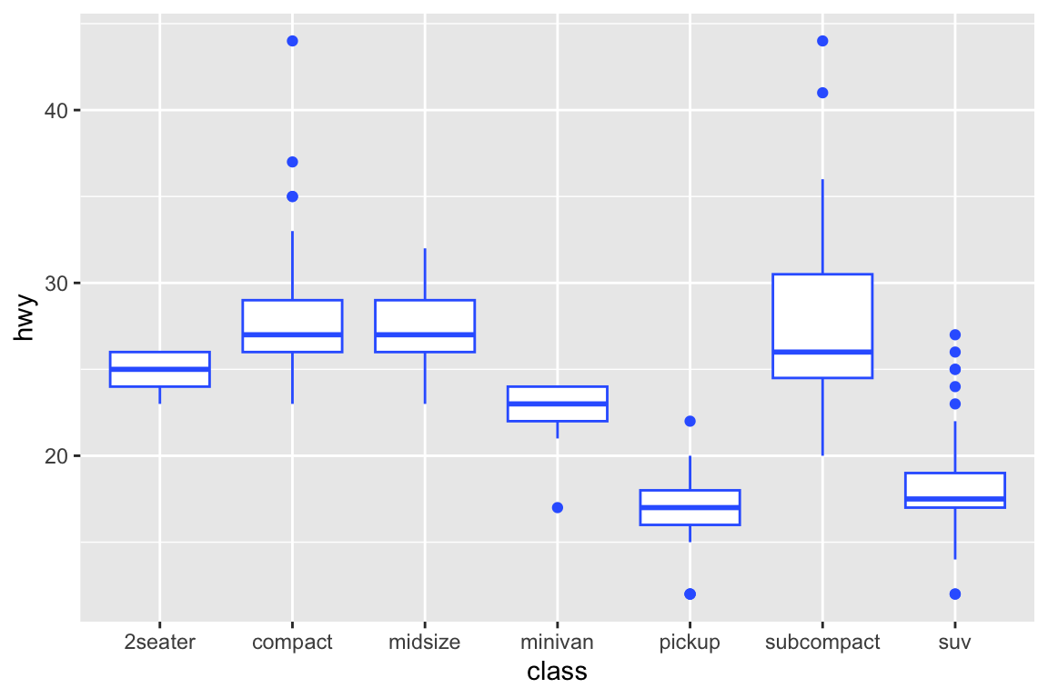
##
## gm_bxp> # By default, outlier points match the colour of the box. Use
## gm_bxp> # outlier.colour to override
## gm_bxp> p + geom_boxplot(outlier.colour = "red", outlier.shape = 1)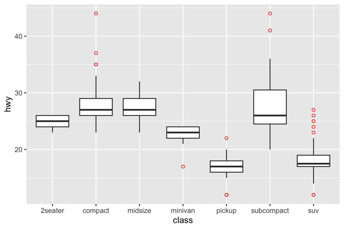
##
## gm_bxp> # Remove outliers when overlaying boxplot with original data points
## gm_bxp> p + geom_boxplot(outlier.shape = NA) + geom_jitter(width = 0.2)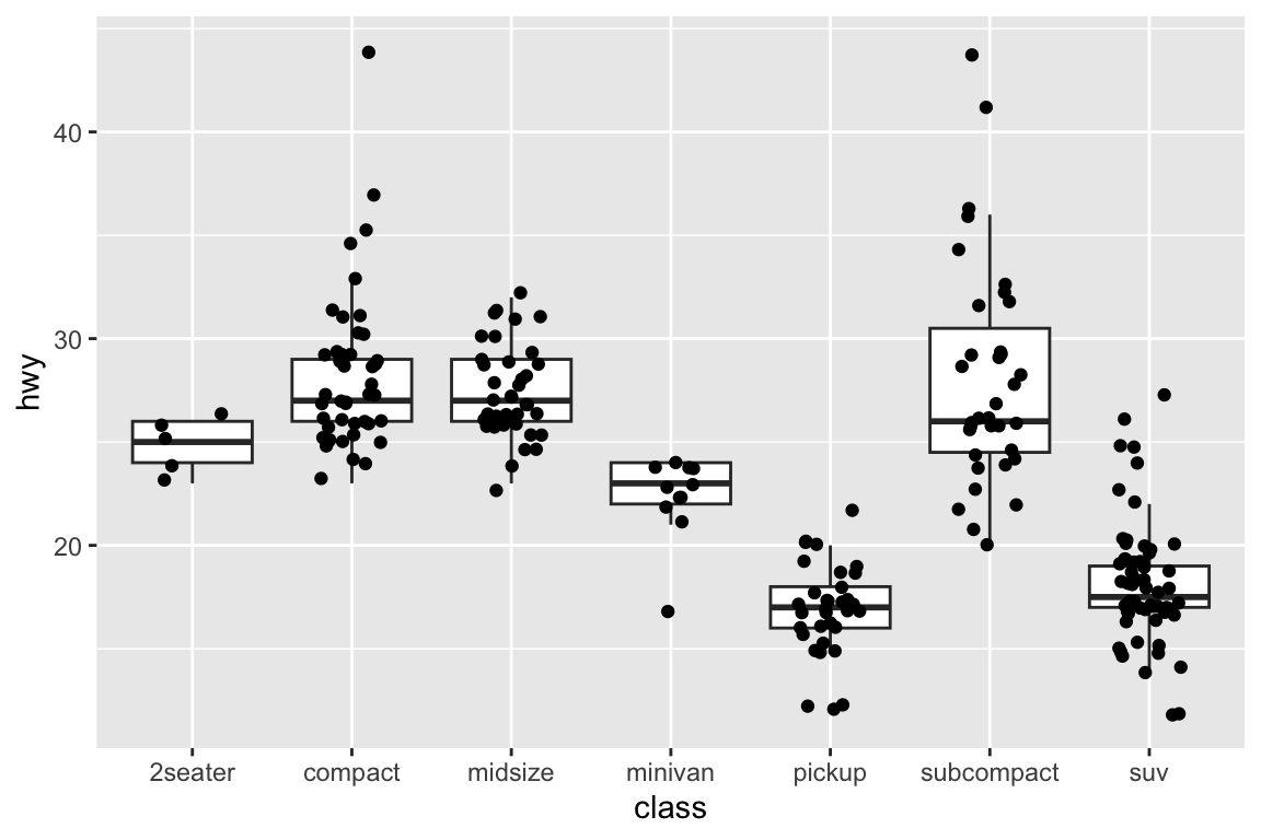
##
## gm_bxp> # Boxplots are automatically dodged when any aesthetic is a factor
## gm_bxp> p + geom_boxplot(aes(colour = drv))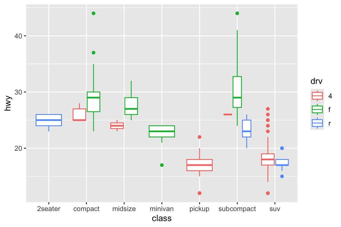
##
## gm_bxp> # You can also use boxplots with continuous x, as long as you supply
## gm_bxp> # a grouping variable. cut_width is particularly useful
## gm_bxp> ggplot(diamonds, aes(carat, price)) +
## gm_bxp+   geom_boxplot()
## Warning: Continuous x aesthetic
## ℹ did you forget `aes(group = ...)`?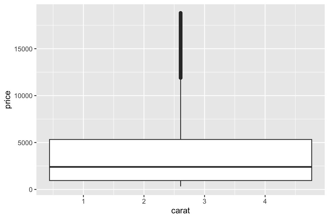
##
## gm_bxp> ggplot(diamonds, aes(carat, price)) +
## gm_bxp+   geom_boxplot(aes(group = cut_width(carat, 0.25)))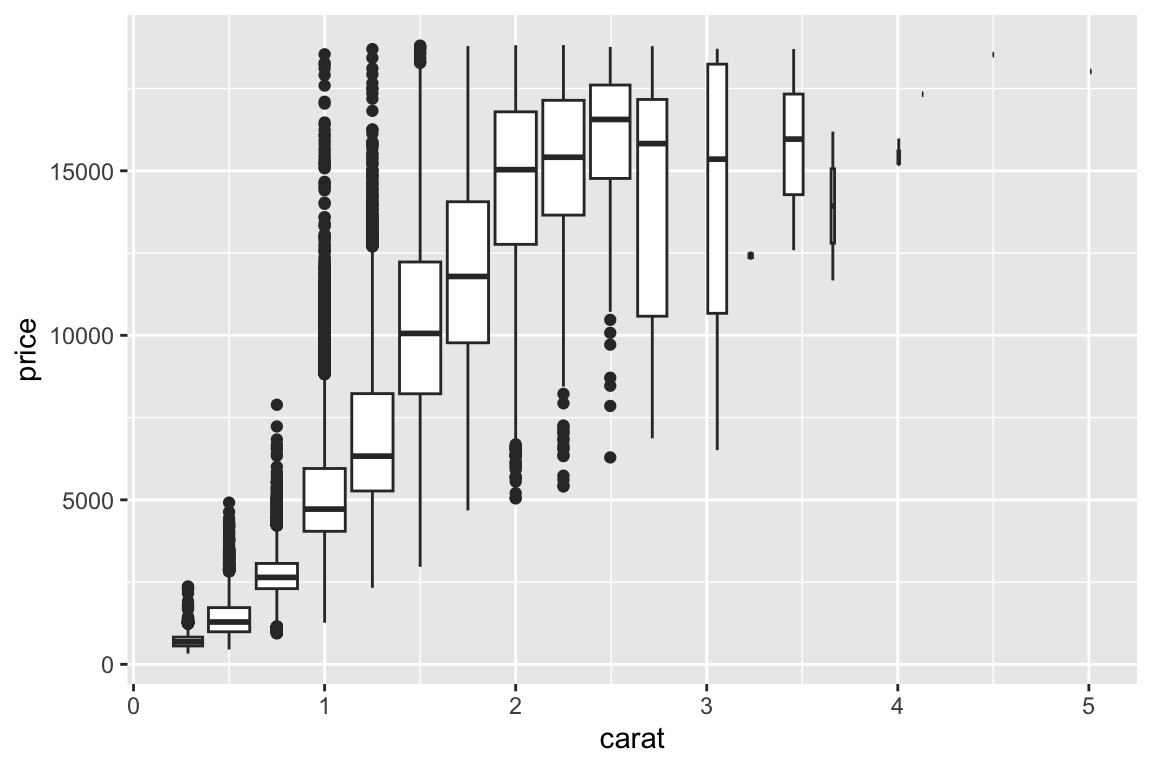
##
## gm_bxp> # Adjust the transparency of outliers using outlier.alpha
## gm_bxp> ggplot(diamonds, aes(carat, price)) +
## gm_bxp+   geom_boxplot(aes(group = cut_width(carat, 0.25)), outlier.alpha = 0.1)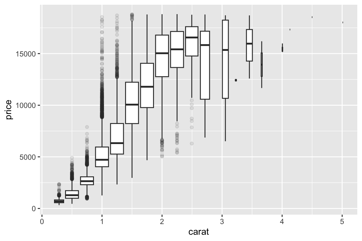
##
## gm_bxp> ## No test:
## gm_bxp> ##D # It's possible to draw a boxplot with your own computations if you
## gm_bxp> ##D # use stat = "identity":
## gm_bxp> ##D set.seed(1)
## gm_bxp> ##D y <- rnorm(100)
## gm_bxp> ##D df <- data.frame(
## gm_bxp> ##D   x = 1,
## gm_bxp> ##D   y0 = min(y),
## gm_bxp> ##D   y25 = quantile(y, 0.25),
## gm_bxp> ##D   y50 = median(y),
## gm_bxp> ##D   y75 = quantile(y, 0.75),
## gm_bxp> ##D   y100 = max(y)
## gm_bxp> ##D )
## gm_bxp> ##D ggplot(df, aes(x)) +
## gm_bxp> ##D   geom_boxplot(
## gm_bxp> ##D    aes(ymin = y0, lower = y25, middle = y50, upper = y75, ymax = y100),
## gm_bxp> ##D    stat = "identity"
## gm_bxp> ##D  )
## gm_bxp> ## End(No test)
## gm_bxp>
## gm_bxp>
## gm_bxp>
>
> example(geom_polygon)
##
## gm_ply> # When using geom_polygon, you will typically need two data frames:
## gm_ply> # one contains the coordinates of each polygon (positions),  and the
## gm_ply> # other the values associated with each polygon (values).  An id
## gm_ply> # variable links the two together
## gm_ply>
## gm_ply> ids <- factor(c("1.1", "2.1", "1.2", "2.2", "1.3", "2.3"))
##
## gm_ply> values <- data.frame(
## gm_ply+   id = ids,
## gm_ply+   value = c(3, 3.1, 3.1, 3.2, 3.15, 3.5)
## gm_ply+ )
##
## gm_ply> positions <- data.frame(
## gm_ply+   id = rep(ids, each = 4),
## gm_ply+   x = c(2, 1, 1.1, 2.2, 1, 0, 0.3, 1.1, 2.2, 1.1, 1.2, 2.5, 1.1, 0.3,
## gm_ply+   0.5, 1.2, 2.5, 1.2, 1.3, 2.7, 1.2, 0.5, 0.6, 1.3),
## gm_ply+   y = c(-0.5, 0, 1, 0.5, 0, 0.5, 1.5, 1, 0.5, 1, 2.1, 1.7, 1, 1.5,
## gm_ply+   2.2, 2.1, 1.7, 2.1, 3.2, 2.8, 2.1, 2.2, 3.3, 3.2)
## gm_ply+ )
##
## gm_ply> # Currently we need to manually merge the two together
## gm_ply> datapoly <- merge(values, positions, by = c("id"))
##
## gm_ply> p <- ggplot(datapoly, aes(x = x, y = y)) +
## gm_ply+   geom_polygon(aes(fill = value, group = id))
##
## gm_ply> p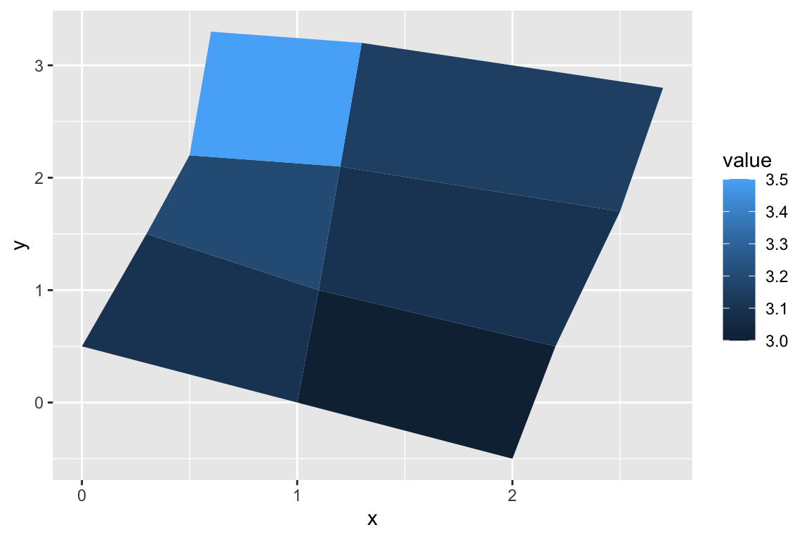
##
## gm_ply> # Which seems like a lot of work, but then it's easy to add on
## gm_ply> # other features in this coordinate system, e.g.:
## gm_ply>
## gm_ply> set.seed(1)
##
## gm_ply> stream <- data.frame(
## gm_ply+   x = cumsum(runif(50, max = 0.1)),
## gm_ply+   y = cumsum(runif(50,max = 0.1))
## gm_ply+ )
##
## gm_ply> p + geom_line(data = stream, colour = "grey30", linewidth = 5)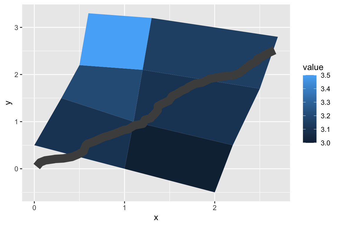
##
## gm_ply> # And if the positions are in longitude and latitude, you can use
## gm_ply> # coord_map to produce different map projections.
## gm_ply>
## gm_ply> if (packageVersion("grid") >= "3.6") {
## gm_ply+   # As of R version 3.6 geom_polygon() supports polygons with holes
## gm_ply+   # Use the subgroup aesthetic to differentiate holes from the main polygon
## gm_ply+
## gm_ply+   holes <- do.call(rbind, lapply(split(datapoly, datapoly$id), function(df) {
## gm_ply+     df$x <- df$x + 0.5 * (mean(df$x) - df$x)
## gm_ply+     df$y <- df$y + 0.5 * (mean(df$y) - df$y)
## gm_ply+     df
## gm_ply+   }))
## gm_ply+   datapoly$subid <- 1L
## gm_ply+   holes$subid <- 2L
## gm_ply+   datapoly <- rbind(datapoly, holes)
## gm_ply+
## gm_ply+   p <- ggplot(datapoly, aes(x = x, y = y)) +
## gm_ply+     geom_polygon(aes(fill = value, group = id, subgroup = subid))
## gm_ply+   p
## gm_ply+ }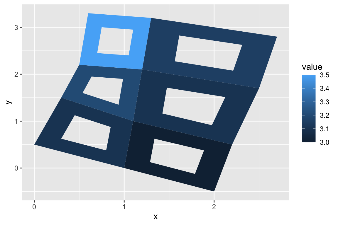
>
> example(geom_raster)
##
## gm_rst> # The most common use for rectangles is to draw a surface. You always want
## gm_rst> # to use geom_raster here because it's so much faster, and produces
## gm_rst> # smaller output when saving to PDF
## gm_rst> ggplot(faithfuld, aes(waiting, eruptions)) +
## gm_rst+  geom_raster(aes(fill = density))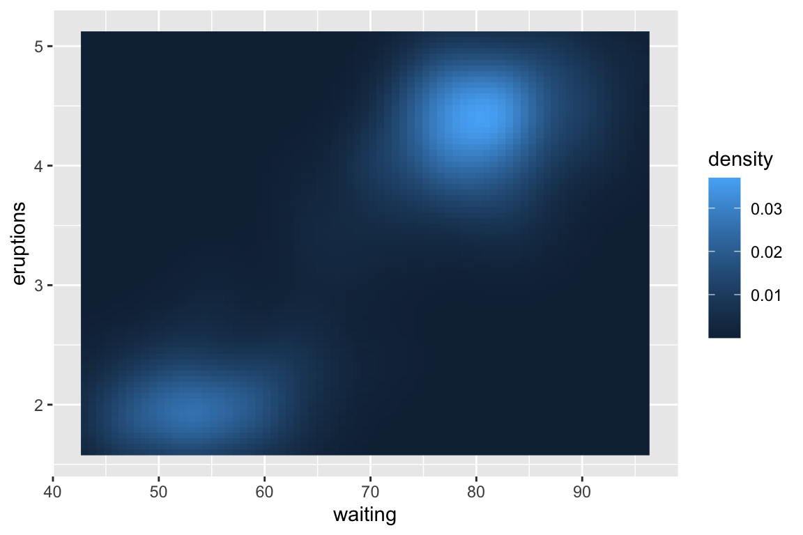
##
## gm_rst> # Interpolation smooths the surface & is most helpful when rendering images.
## gm_rst> ggplot(faithfuld, aes(waiting, eruptions)) +
## gm_rst+  geom_raster(aes(fill = density), interpolate = TRUE)
##
## gm_rst> # If you want to draw arbitrary rectangles, use geom_tile() or geom_rect()
## gm_rst> df <- data.frame(
## gm_rst+   x = rep(c(2, 5, 7, 9, 12), 2),
## gm_rst+   y = rep(c(1, 2), each = 5),
## gm_rst+   z = factor(rep(1:5, each = 2)),
## gm_rst+   w = rep(diff(c(0, 4, 6, 8, 10, 14)), 2)
## gm_rst+ )
##
## gm_rst> ggplot(df, aes(x, y)) +
## gm_rst+   geom_tile(aes(fill = z), colour = "grey50")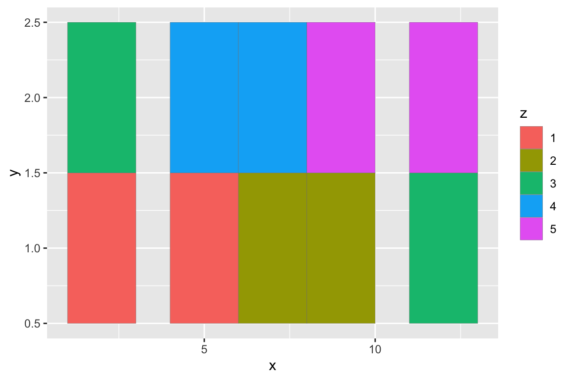
##
## gm_rst> ggplot(df, aes(x, y, width = w)) +
## gm_rst+   geom_tile(aes(fill = z), colour = "grey50")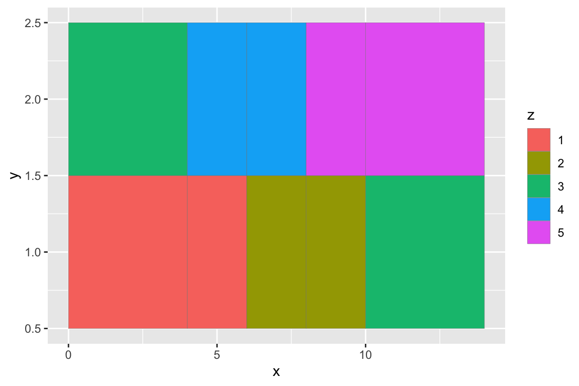
##
## gm_rst> ggplot(df, aes(xmin = x - w / 2, xmax = x + w / 2, ymin = y, ymax = y + 1)) +
## gm_rst+   geom_rect(aes(fill = z), colour = "grey50")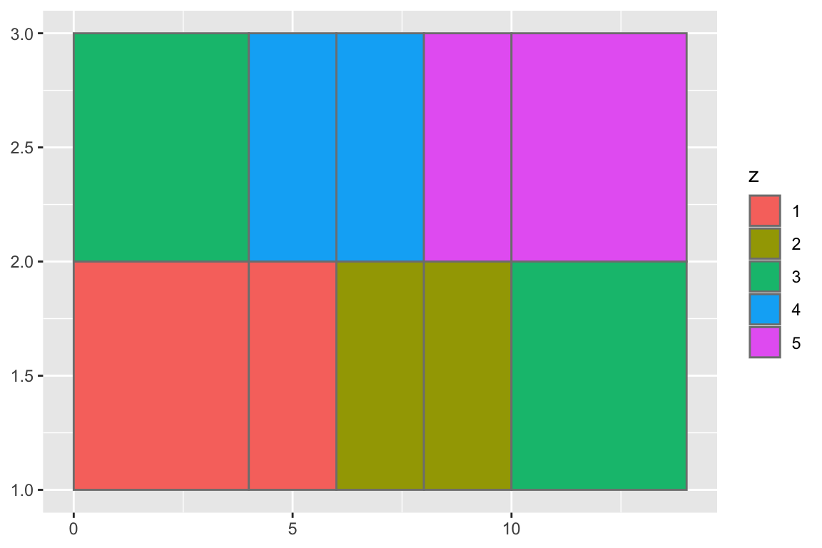
##
## gm_rst> ## No test:
## gm_rst> ##D # Justification controls where the cells are anchored
## gm_rst> ##D df <- expand.grid(x = 0:5, y = 0:5)
## gm_rst> ##D set.seed(1)
## gm_rst> ##D df$z <- runif(nrow(df))
## gm_rst> ##D # default is compatible with geom_tile()
## gm_rst> ##D ggplot(df, aes(x, y, fill = z)) +
## gm_rst> ##D   geom_raster()
## gm_rst> ##D # zero padding
## gm_rst> ##D ggplot(df, aes(x, y, fill = z)) +
## gm_rst> ##D   geom_raster(hjust = 0, vjust = 0)
## gm_rst> ##D
## gm_rst> ##D # Inspired by the image-density plots of Ken Knoblauch
## gm_rst> ##D cars <- ggplot(mtcars, aes(mpg, factor(cyl)))
## gm_rst> ##D cars + geom_point()
## gm_rst> ##D cars + stat_bin_2d(aes(fill = after_stat(count)), binwidth = c(3,1))
## gm_rst> ##D cars + stat_bin_2d(aes(fill = after_stat(density)), binwidth = c(3,1))
## gm_rst> ##D
## gm_rst> ##D cars +
## gm_rst> ##D   stat_density(
## gm_rst> ##D     aes(fill = after_stat(density)),
## gm_rst> ##D     geom = "raster",
## gm_rst> ##D     position = "identity"
## gm_rst> ##D    )
## gm_rst> ##D cars +
## gm_rst> ##D   stat_density(
## gm_rst> ##D     aes(fill = after_stat(count)),
## gm_rst> ##D     geom = "raster",
## gm_rst> ##D     position = "identity"
## gm_rst> ##D   )
## gm_rst> ## End(No test)
## gm_rst>
## gm_rst>
## gm_rst>- More examples - change the coordinate transformations:
> rm(list=ls())
>
> p <- ggplot(data = diamonds)
> p <- p + aes(x = carat, y = price)
> p <- p + geom_point()
> p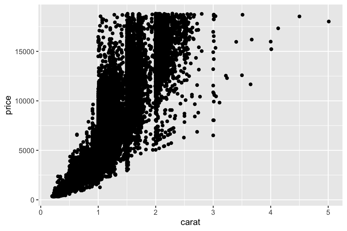
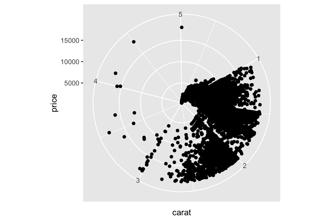
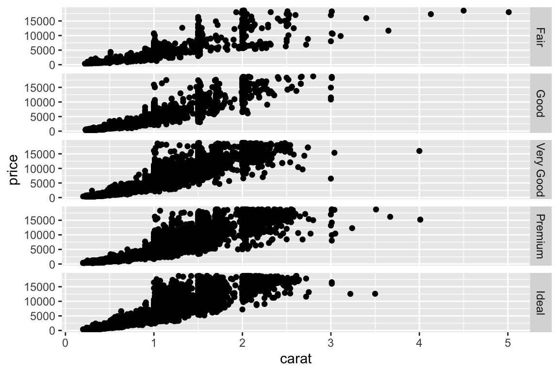
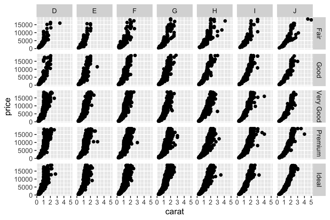
- More examples - change to multiplanel display. Add a
facet_gridto split the plot in multiple panels:
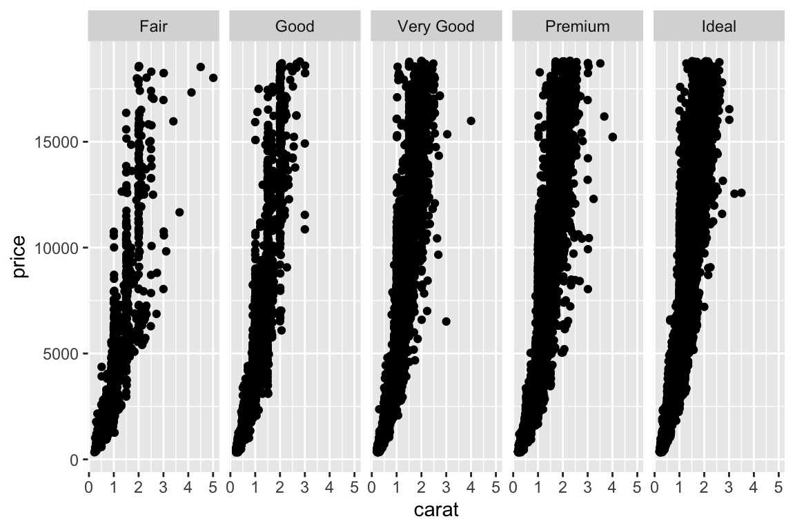
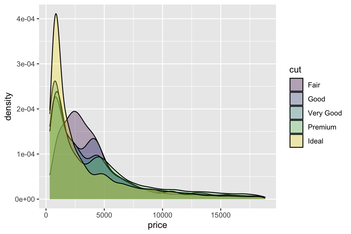
Density plot:
- Attributes (colour, shape, fill, linetype, etc) have automatically become grouping variables.
- Note the specification of transparency through the alpha argument: alpha blending.